
Boreal River Expeditions
Enhancing clarity and confidence in high-consideration expedition bookings.
Project Overview
Boreal River Expeditions offers multi-day whitewater and backcountry trips in remote regions. These adventures have longer decision cycles, involve higher prices, and require visitors to understand logistics, difficulty, equipment, and group dynamics.
The challenge wasn’t just visibility — it was helping visitors quickly answer: “Is this trip right for me?”
My goal was to support the brand by improving the clarity, structure, and presentation of expedition pages, making the research and booking process feel intuitive and trustworthy.
My Role
Page publishing & structure implementation
Collaborated with leadership and a freelance SEO specialist
Executed EN/FR content updates and layout improvements
Selected and formatted visuals to enhance confidence and clarity
Made SEO adjustments based on recommendations
I was responsible for bringing the improved pages to life and ensuring they performed consistently across the site.
What Needed Improving
Through analytics and team discussion, we identified that visitors often needed:
clearer trip summaries and “who it’s for” guidance
better logistics explanations (duration, difficulty, equipment)
stronger content hierarchy (what do I read first?)
easier navigation across routes and variations
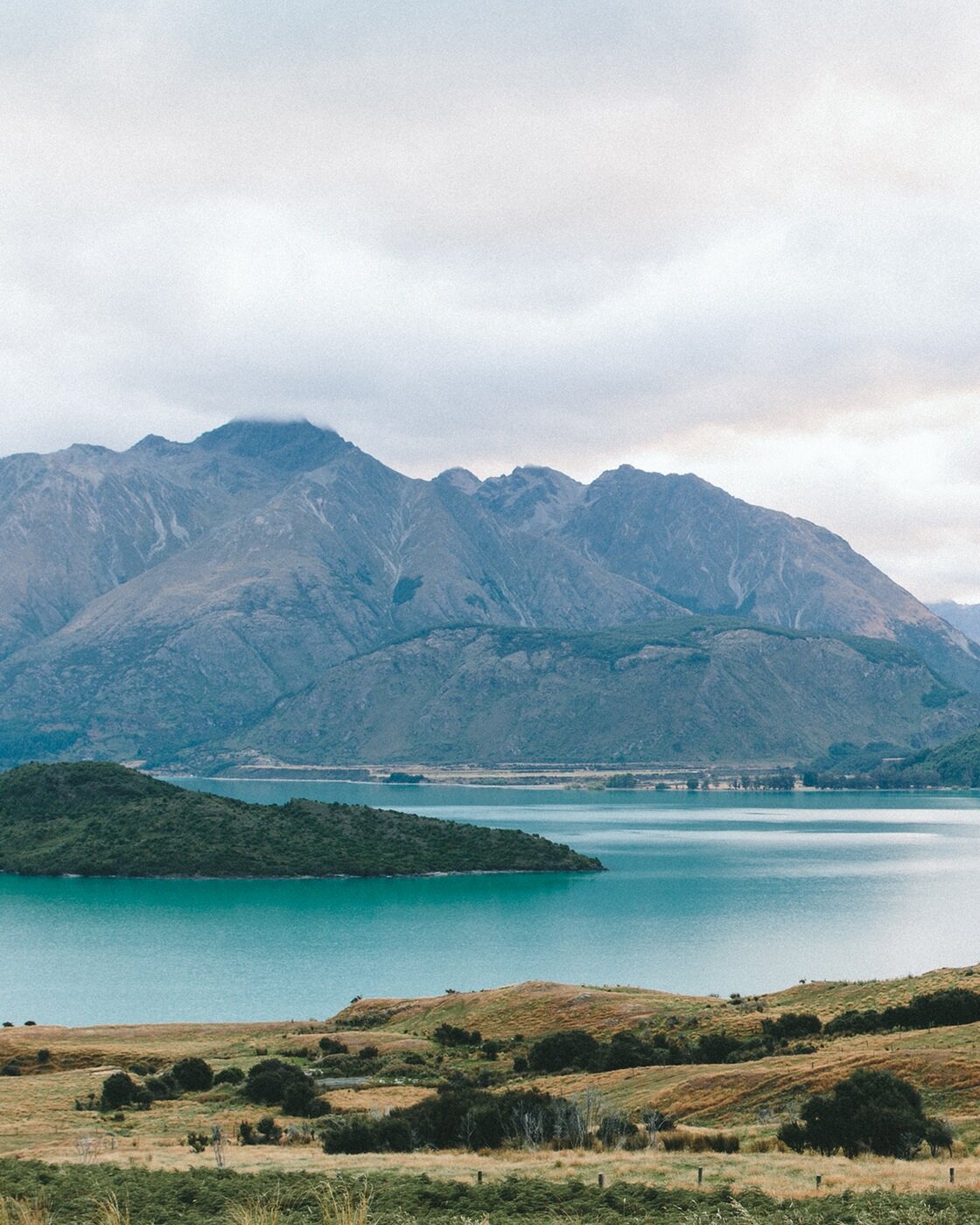
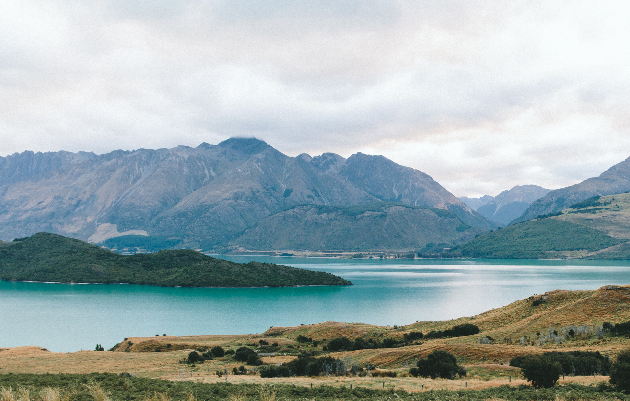
more confidence-inspiring visual storytelling
This is typical for high-trust products.
What I Did
Implemented UX recommendations to improve readability and flow
Restructured headings, details, and section order for clarity
Added bilingual content and ensured consistency in EN/FR versions
Selected & formatted photography that communicated the experience
Updated metadata and page elements for early SEO gains
Integrated booking information more clearly into the narrative
Focus: make the decision process easier and reduce friction.
Improvements & Impact
Expeditions naturally has a longer sales cycle — bookings often unfold over weeks of research. While major SEO performance is still building, early positive signals include:
Increased clarity and consistency across trip pages
Better user guidance for choosing the right expedition
More immersive browsing experience reflecting real trip conditions
Stronger foundations for future SEO growth and seasonal booking pushes
Reduced confusion and fewer “Where do I start?” questions from users
These changes support long-term conversion and improve trust with prospective travelers.
Content & UX Enhancements
insert some visual examples of ux improvements.
before/after content hierarchy
restructured “trip overview” and “Who it’s for” sections
improved photo placement to match story flow
cleaner multi-language layout
simplified pricing + logistics presentation
stronger hero images + section dividers
This section helps visitors and recruiters see your ux logic
Reflection & Skills Demonstrated
This project deepened my understanding of:
UX for long-consideration journeys
Structuring content for high-intent decision-making
Integrating bilingual content seamlessly
Coordinating with SEO contractors and leadership
Presenting complex trip information clearly
It strengthened my ability to execute improvements that build trust — even when immediate metrics are still developing.